
Contributions
Organization
AzaveaBackground
Azavea is a B-Corp that builds cutting-edge software for a broad range of clients, including non-profits, government agencies, cities, museums, and more. When I started as a User Experience Designer at Azavea in 2017, only a quarter of my time was devoted to expanding Azavea’s brand identity in both the virtual and physical world.
Opportunities
When I started, Azavea’s branding and design assets were scattered across drives and out-of-date wikis while branded microsites and landing pages all varied in treatment. Employees also frequently didn’t know where to locate assets or mission statements.
The company’s overall brand identity has always been strong and crystal clear: Azavea does brilliant, cutting edge work in geospatial, and has values that affect every aspect of the business, from how it chooses projects to the compost buckets in the kitchen.
Branding guide and toolkit
When I started, the company had a simple guide detailing use of its logo. However, it only covered logo usage guidelines and was in a PDF in the company’s shared drive.
I took on the mantle of creating a digital branding guide and digital toolkit in order to establish and maintain shareable brand assets and visuals. Creating a digital branding guide allowed me to more easily expand the existing guidelines, create a more accessible/shareable guide for people in and outside of the company, and collaborate cross-functionally on updates.
Ultimately, I planned to solve several issues with the new digital guide:
- Collate company information. The company’s mission statement, history, voice and tone, and other information were buried in various wikis and documents, most in various states of disuse. I gathered all the information and organized it in the new guide.
- Introduce internal clarity for Azavea’s libraries and products. Azavea is unique in that the company maintains several open source libraries and SaaS products. Similarly to the main brand, there was no one place in which someone could access high-level, differentiating information or logo downloads for each of these identities. This was particularly problematic for new employees, who often voiced confusion.
- Make it easier to access up-to-date assets. Azavea’s color and knockout logos were all in different locations. Many designers over the years had created the company’s sub-brands. Relevant logo files and formats were inconsistently created or non-existent.
- Establish color and typography guidelines. Other than the colors in the logo, there was no established color palette for the company. There were also many different typefaces in use across Azavea’s print collateral and websites.


Color palette that I developed for Azavea.
The new digital toolkit includes elements from the original branding guide created by Azavea’s logo designer, but with ample options to download logo assets. Products and open-source libraries have their own page where a colleague can download logo assets, easily locate the website link, or copy/paste taglines and elevator pitches.
The guide is also searchable, and contains a changelog so that I can share more details about additions and adjustments made to the guide over time.
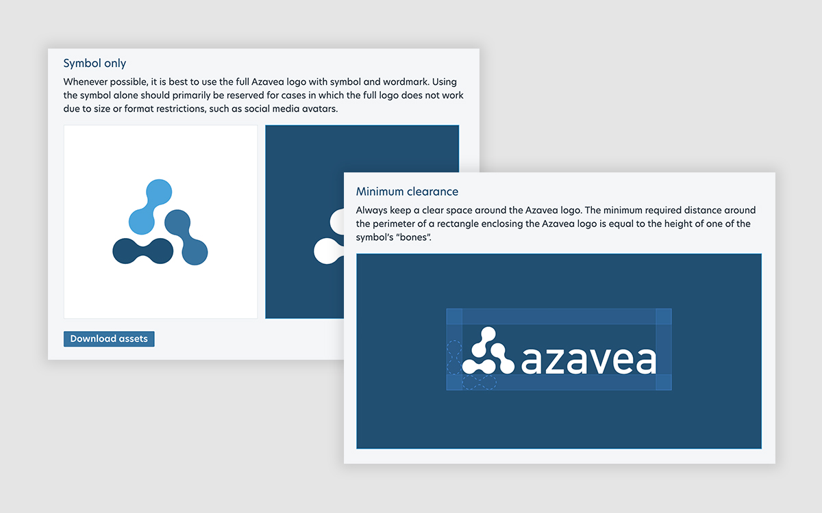
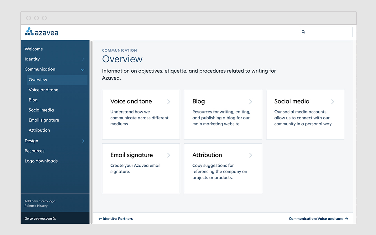
Screenshots from Azavea’s digital branding guide and toolkit.
Establishing visual patterns and choosing a new typeface
Throughout the process of building this digital toolkit, it quickly became clear that there was considerable inconsistency in how branded content was handled. For example, there were many typefaces in use across Azavea’s web and print materials. In order to create an identifiable visual language for Azavea, I made sure to establish additional design rules.
Pattern
Since Azavea’s work is typically geospatial in nature, I introduced topographic patterns to our brand-kit. These add visual punch and texture to our web and print materials, while hinting to the nature of our work.


Topographic patterns and an example of how they are applied in practice.
Typography
Prior to my involvement, websites and print materials all used different typefaces. I audited our web and print materials to identity fonts currently in use, and researched potential alternative options for our typeface. Ultimately, I landed on New Hero.
New Hero boasts a large font family, which I knew would give us a lot of flexibility over the ensuing years. It has a geometric style that feels modern and also a bit of quirky personality that keeps our content from looking too corporate. The foundry’s description that New Hero is “dedicated to civic duty” is also a particularly relevant tie-in to our mission statement, which is to create software for “positive civic, social, and environmental impact”.

I presented this option to our CEO, Design Team Lead, and Business Development professionals and began the process of replacing other typefaces in our marketing materials.
Microsites
I have led the redesign of several key microsites for Azavea. One of my primary focuses has been on ensuring that Azavea websites feel as though they are a part of the same family. To this end, I have since applied a new set of visual principles and patterns to several branded microsites.
For example, I redesigned a website called “Redistricting the Nation”. The website consistently got good traffic in search engines, but looked dated and had several broken interactive features. The CEO wanted to retain the website as a microsite so that we could continue to get traffic through this avenue.


Old Redistricting the Nation website alongside the new Redistricting microsite.
I addressed several key issues with the previous site, but most notably re-branded the it to more clearly align it with Azavea’s brand. Setting the primary domain name to be a subdomain of Azavea’s website: redistricting.azavea.com, I also designed the microsite to more clearly reference Azavea’s brand in color, typography, and style. This included replaced the previous custom logo (Redistricting the Nation) with a sub-brand called: Azavea Redistricting.


Home and Interviewing pages on the new Careers site.


Design applied to Fellowship and Summer of Maps microsites (design and development executed by Matt Williams)
Print and Apparel
I’ve also since been the primary designer for Azavea’s print and apparel. This has meant representing our brand in fresh, inventive ways for internal and external recognition:
- Employee gifts. I’ve had the chance to apply Azavea’s brand to custom apparel for both adult Azaveans and their children.
- Internal awards and incentives. This has included a broad range of projects, including end-of-year award plaques and custom challenge coins for my colleagues. The coins are handed out monthly, and awarded to people who participate in talks (creatively named the “Talk Award” coins) or write engaging blogs (also simply called the ”Blog Award” coins).
- Print collateral, such as business development proposal templates. The latter are used by my colleagues to send to clients, and required some instruction content. They were also painstakingly (painstakingly) created in Microsoft Word.


Various examples of the brand applied to print and apparel.
Results
All told, this work has been a massive effort completed over four years. Some of the early Branding Guide work has been hugely valuable in communicating changes and sharing assets with my colleagues, and is also regularly used for onboarding and sharing outside of the company for PR and partnerships. This is an ongoing effort, but rewarding in that designers and employees at Azavea now have access to a clearer set of branding assets, guidelines, and patterns.
