Brand identity and website design for the first AI annotation tool built with satellite imagery in mind.
Contributions
Organization
AzaveaBackground
In 2019 I developed a brand identity for a SaaS product used by professionals aiming to label satellite imagery for AI. There were many excellent labeling tools, but none developed with geospatial data as the focus. The product enabled data labeling teams to easily and efficiently label large amounts of images.
Starting the branding process
The team chose the name based on the idea that labeling data sets the “groundwork” for every machine learning project. With this concept in mind, I began exploring potential images that could highlight GroundWork’s important role.
I began sketching monograms for the logomark:

Early monograms for the newest Azavea software.
Initially, I was most drawn to three visual concepts: a lightbulb, map marker, and hot air balloon. Each pointed out a key differentiator for GroundWork. The first referenced the fact that ground is the reference point in an electrical current through which voltages are measured, which related to how GroundWork helps organizations establish “ground truth” in machine learning projects. The second was more simple, simply referencing that GroundWork is made for labeling map data, as that presents unique challenges to practicioners.
The mark that the team liked most ended up being the third option, which may be the most abstract and playful concept of the three: a hot air balloon. This was meant to represent the perspective that accurate labeling will offer a machine learning project by highlighting the high vantage point from which satellite imagery is taken.

The final logo.
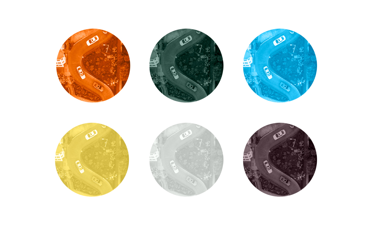
I paired the mark with the approachable geometric typeface Urbane and developed a color scheme for UI and collateral applications.
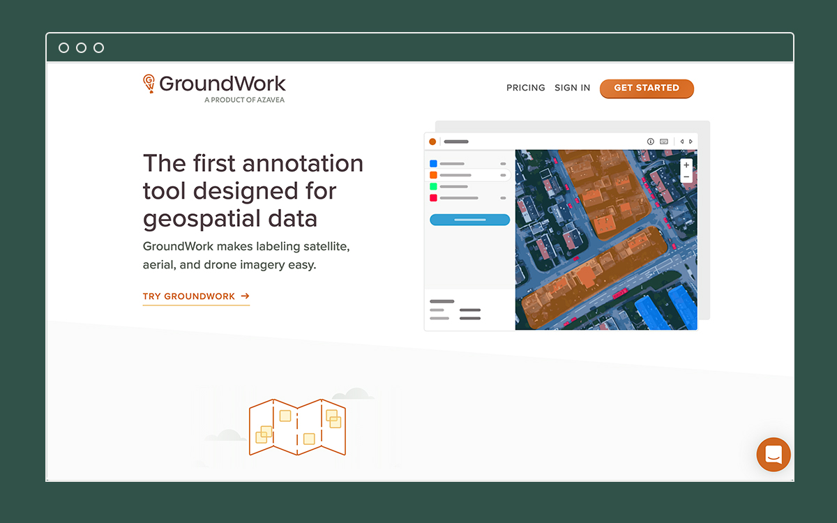
Marketing website
All of this was applied to the GroundWork marketing website, for which I completed the initial wireframes and design. My fantastic colleague, Matt Williams developed the website and added additional illustrations.
Applied brand
The whimsy of the GroundWork logo has been carried through follow-up design work, such as supporting illustrations, apparel for employees, and stickers.
Multiple applications of the brand.


